Rig is free to download and use for both commercial and non-commercial work under the SIL Open Font License. Enter your email to get the full family and start experimenting. Use it, play with it and put it to work.
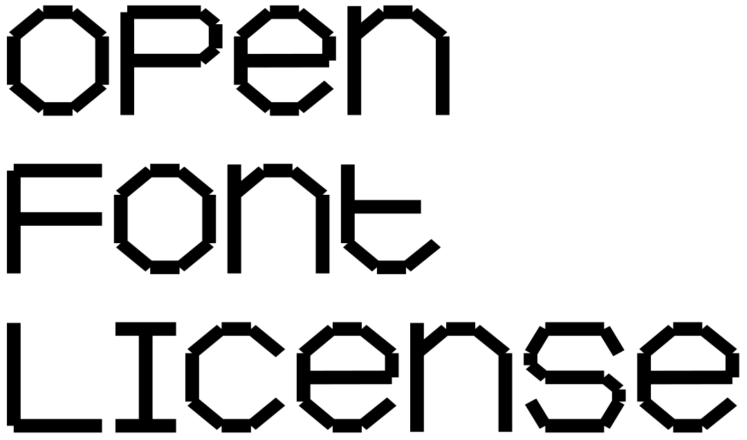
Rig started as an experiment with variable type and a simple constraint: straight lines that connect at the ends. It was never meant to be finished, but a typeface emerged that sits somewhere between a system and an accident.
Weight and width pull the underlying structure in different directions, from skeletal and precise to dense and a bit awkward. Mostly uppercase with a handful of lowercase letters, Rig has a bit of an identity crisis. Mechanical but playful, systematic but unruly, readable one minute and abstract the next.
We never quite knew what to do with it. It’s experimental by nature and we can’t promise it will always behave as expected. So we decided to set it free.
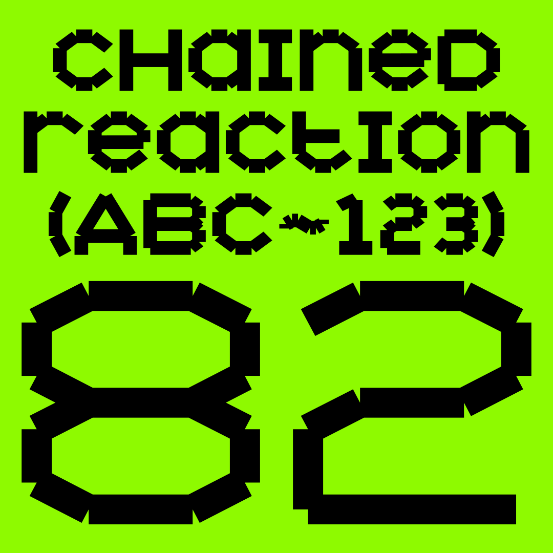
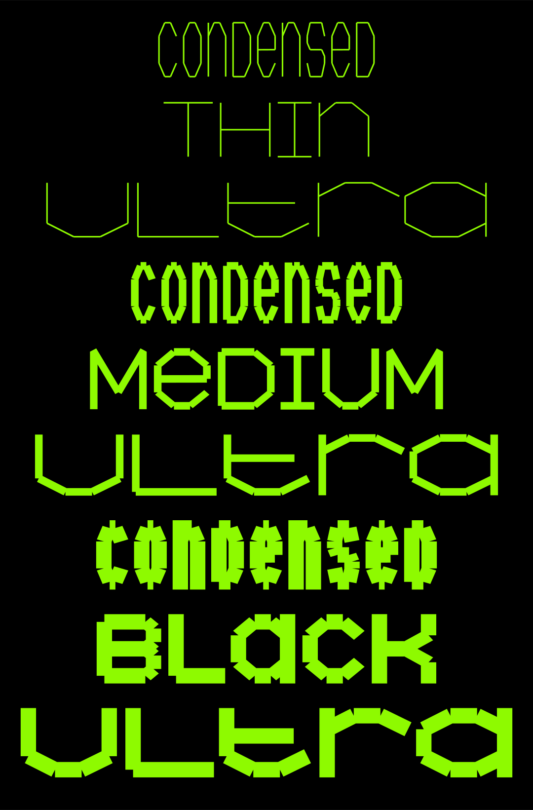
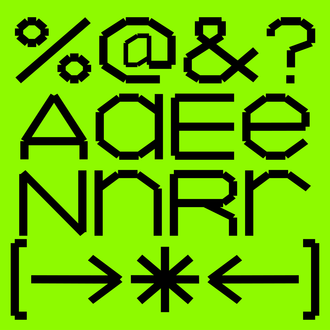
Rig started as an experiment with variable type and a simple constraint: straight lines that connect at the ends. It was never meant to be finished, but a typeface emerged that sits somewhere between a system and an accident.
Weight and width pull the underlying structure in different directions, from skeletal and precise to dense and a bit awkward. Mostly uppercase with a handful of lowercase letters, Rig has a bit of an identity crisis. Mechanical but playful, systematic but unruly, readable one minute and abstract the next.
We never quite knew what to do with it. It’s experimental by nature and we can’t promise it will always behave as expected. So we decided to set it free.